
Excel is often used to store large amounts of information, but simply entering data into rows and columns is only the beginning. When a worksheet contains hundreds or thousands of records, finding useful information manually can become difficult and time-consuming. This is where Pivot Tables become extremely useful. With a Pivot Table, you can quickly summarize, compare, group, and analyze data without changing the original dataset.
For beginners, learning how to Create and Use Pivot Tables can make Excel much easier to handle. You can use a Pivot Table to calculate total sales by month, compare marks by subject, count employees by department, analyze expenses by category, or summarize any other properly organized dataset.
The best part is that you do not need advanced Excel formulas to get started. Once you understand the basic structure of a Pivot Table and how its fields work, you can create useful reports in just a few steps.
This beginner-friendly guide explains how Pivot Tables work, how to Create and Use Pivot Tables from scratch, how to arrange fields, filter and group information, change calculations, refresh data, and avoid common mistakes. It also includes simple examples that students, teachers, job seekers, office workers, and other Excel users can follow.
See More:-
- MS Word Tutorial
- MS Excel Tutorial
- MS PowerPoint Tutorial
- MS OneNote Turorial
- Excel Basic Functions: Complete Guide, Formulas, Examples & Tips
- How to use VLOOKUP and XLOOKUP in Excel Step by Step
What Is a Pivot Table in Excel?
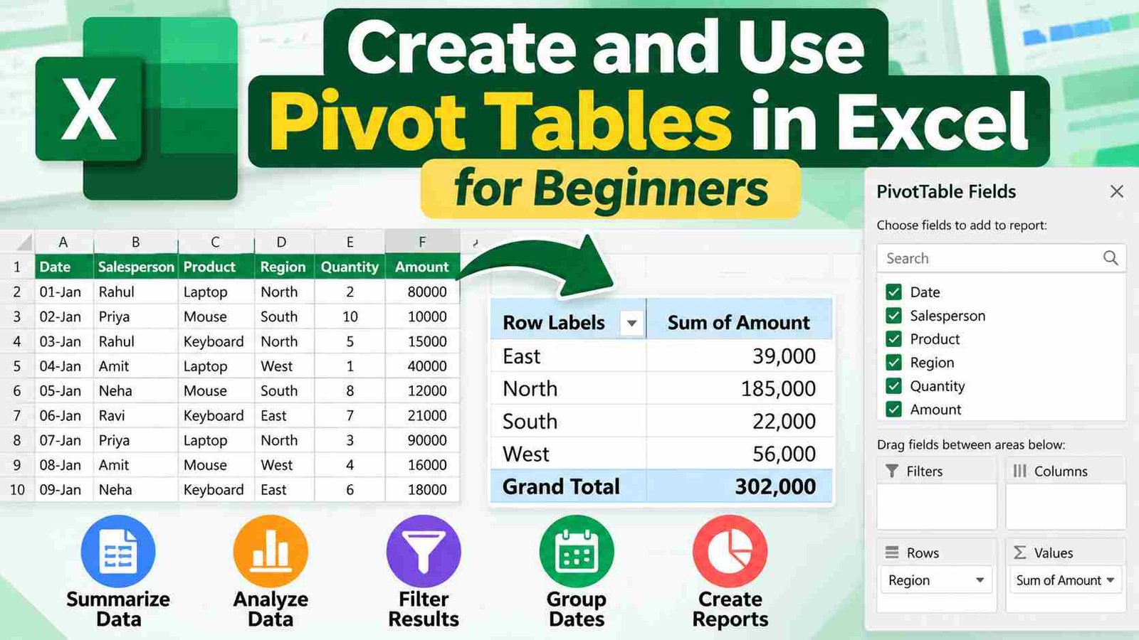
A Pivot Table is an Excel tool used to summarize and analyze a large dataset by rearranging its information into a more meaningful report. Instead of manually calculating totals, counts, or averages, Excel can automatically organize the data according to the fields you select.
For example, suppose you have a sales worksheet containing these columns:
| Date | Salesperson | Product | Region | Quantity | Amount |
|---|---|---|---|---|---|
| 01-Jan | Rahul | Laptop | North | 2 | 80000 |
| 02-Jan | Priya | Mouse | South | 10 | 10000 |
| 03-Jan | Rahul | Keyboard | North | 5 | 15000 |
| 04-Jan | Amit | Laptop | West | 1 | 40000 |
A normal worksheet shows individual transactions. A Pivot Table can summarize the same information and answer questions such as:
- How much did each salesperson sell?
- Which region generated the highest amount?
- How many laptops were sold?
- How much was sold in each month?
- What is the average sales amount by product?
A Pivot Table does not normally change the original data. Instead, it creates a separate summary based on the source information.
Why Are Pivot Tables Important?
Pivot Tables are useful because they turn raw data into information that is easier to understand.
Imagine having 5,000 rows of student marks. Finding the average marks for each class manually would require considerable work. A Pivot Table can summarize that information quickly.
Some common uses include:
| Purpose | Example |
|---|---|
| Total | Total sales by product |
| Count | Number of students in each class |
| Average | Average marks by subject |
| Comparison | Sales by region |
| Grouping | Expenses by month |
| Filtering | Sales for a particular employee |
| Ranking | Products with higher sales |
| Reporting | Monthly performance summary |
For students, Pivot Tables are also useful for practical assignments and computer exams. For office users, they are widely useful when working with reports, attendance sheets, inventory, sales data, survey responses, or financial records.
How Does a Pivot Table Work?
The easiest way to understand a Pivot Table is to think of it as a system that rearranges the columns of your dataset.
Suppose your data has these fields:
Date, Employee, Department, Product, Quantity, Amount
Excel lets you place those fields into different areas of the Pivot Table.
The main areas are:
| PivotTable Area | Purpose |
|---|---|
| Rows | Displays categories vertically |
| Columns | Displays categories horizontally |
| Values | Performs calculations such as Sum or Count |
| Filters | Filters the entire Pivot Table |
For example, you can place Department in Rows and Amount in Values. Excel can then show the total amount for each department.
If you place Month in Rows and Department in Columns, the Pivot Table can create a month-by-department comparison.
This flexibility is the main reason Pivot Tables are called “pivot” tables: you can rearrange the same data from different perspectives.
What Data Should You Use for a Pivot Table?
Before you Create and Use Pivot Tables, your source data should be organized properly. A poorly structured dataset can cause incorrect results or make Pivot Table creation more difficult.
A good dataset generally has:
- One header row.
- A unique heading for every column.
- No completely blank rows within the dataset.
- No completely blank columns within the dataset.
- Consistent data types.
- One record per row.
- Similar information stored consistently.
For example, this is a good structure:
| Student | Class | Subject | Marks |
|---|---|---|---|
| Aman | 10 | Maths | 85 |
| Neha | 10 | Maths | 91 |
| Aman | 10 | English | 78 |
| Neha | 10 | English | 88 |
Here, each row represents one record.
However, a structure like this can create problems:
| Student | Maths | English | Science |
|---|---|---|---|
| Aman | 85 | 78 | 90 |
| Neha | 91 | 88 | 93 |
This second format can still be analyzed in Excel, but for many Pivot Table tasks, a normalized or “flat” data layout with one field per column and one record per row is easier to work with.
Preparing Your Excel Data Before Creating a Pivot Table
Good preparation makes the Pivot Table process much smoother.
Use Clear Column Headings
Every column should have a meaningful name such as:
Date, Name, Department, Product, Quantity, Amount
Avoid unnecessary duplicate headings.
Remove Unwanted Blank Rows
Blank rows can interfere with automatic data detection. Keep the dataset continuous wherever possible.
Check Dates and Numbers
A date should be stored as an actual Excel date rather than text that only looks like a date.
Similarly, values such as:
₹10,000
should generally be numeric values with currency formatting rather than text created by typing the currency symbol into a text string.
Keep Categories Consistent
These entries are technically different text values:
- North
- north
- NORTH
- North
Extra spaces or inconsistent capitalization can lead to unexpected categories in a Pivot Table.
Convert the Dataset to an Excel Table
A particularly useful step is converting your data into an Excel Table using Ctrl + T.
Excel Tables automatically expand as new rows are added, making them convenient sources for reports and Pivot Tables. You should still verify the source and refresh the Pivot Table after adding new data.
How to Create a Pivot Table in Excel
Creating your first Pivot Table is straightforward.
Step 1: Select Your Data
Click any cell inside your dataset.
You do not always need to manually highlight the entire range when the data is properly structured. Excel can often identify the surrounding dataset automatically.
Step 2: Open the Insert Tab
Go to the Insert tab on the Excel ribbon.
Look for the PivotTable option.
Step 3: Select PivotTable
Click PivotTable.
Excel will usually display a dialog box asking you to confirm the source data and choose where you want the Pivot Table to appear.
Step 4: Check the Table or Range
Make sure the correct source range or table name is selected.
If the selected range is incorrect, your Pivot Table may exclude some records or include unrelated cells.
Step 5: Choose the Destination
You can generally place the Pivot Table on:
- A new worksheet.
- An existing worksheet.
For beginners, a new worksheet is often easier because the summary has its own workspace.
Step 6: Click OK
Excel creates the Pivot Table area and displays the PivotTable Fields pane.
You will then see your dataset’s column headings as available fields.
This is where you start arranging the report.
Understanding the PivotTable Fields Pane
The PivotTable Fields pane is the control center for your Pivot Table.
It typically contains your available fields and four main areas:
Filters, Columns, Rows, and Values
Suppose the dataset contains:
Student, Class, Subject, Marks
You can create a simple report by placing:
- Class → Rows
- Marks → Values
Excel can then summarize marks for each class.
If you place:
- Subject → Rows
- Class → Columns
- Marks → Values
you can compare marks across classes and subjects.
The same dataset can produce many different reports depending on where you place the fields.
Understanding the Rows Area
The Rows area determines what appears vertically in the Pivot Table.
For example, if you place Department in Rows, Excel may show:
| Department | Total Amount |
|---|---|
| HR | 50000 |
| IT | 120000 |
| Sales | 175000 |
Rows are useful when you want to see a list of categories.
Common fields used in Rows include:
- Department
- Product
- Employee
- Student
- Subject
- City
- Region
- Month
You can also place more than one field in the Rows area. For example, placing Region above Salesperson creates a hierarchy where employees are organized under regions.
Understanding the Columns Area
The Columns area displays categories horizontally.
For example, suppose you place Month in Columns and Amount in Values. Your report might look like:
| Product | January | February | March |
|---|---|---|---|
| Laptop | 80000 | 90000 | 70000 |
| Mouse | 15000 | 18000 | 21000 |
This layout is useful for comparisons across multiple categories.
You can use Columns when a horizontal comparison makes the report easier to read.
Understanding the Values Area
The Values area contains the calculations performed by Excel.
Depending on the type of data and the selected calculation, Excel may use:
- Sum
- Count
- Average
- Maximum
- Minimum
- Product
- Percentage calculations
For example, placing Sales Amount into Values may produce:
Sum of Sales Amount
If the source contains employee names instead, Excel may use a count.
Understanding the Values area is essential because putting a field in Values does not necessarily mean Excel will calculate what you expect.
Understanding the Filters Area
The Filters area allows you to filter the entire Pivot Table.
Suppose your report contains sales from North, South, East, and West regions.
If you place Region into Filters, you can choose one region and view its summarized results.
This is useful when a report contains many categories but you need to focus on a specific subset of the data.
Simple Example: Creating a Student Marks Pivot Table
Consider this sample dataset:
| Student | Class | Subject | Marks |
|---|---|---|---|
| Amit | 10 | Maths | 85 |
| Neha | 10 | Maths | 92 |
| Amit | 10 | English | 78 |
| Neha | 10 | English | 88 |
| Ravi | 11 | Maths | 81 |
| Pooja | 11 | Maths | 95 |
| Ravi | 11 | English | 84 |
| Pooja | 11 | English | 90 |
Suppose you want to compare total marks by class.
Create the Pivot Table and arrange the fields as:
Rows: Class
Values: Marks
Excel can summarize the marks for Class 10 and Class 11.
You could also create a subject-wise report:
Rows: Subject
Columns: Class
Values: Average of Marks
Now the report can compare the average marks across subjects and classes.
This example demonstrates an important idea: the source data stays the same, but changing the field arrangement creates a different analysis.
How to Change Sum to Average, Count, Maximum, or Minimum
Excel does not restrict you to Sum.
Suppose you have added Marks to Values, and Excel displays Sum of Marks. You may actually want the average marks.
To change the calculation:
- Click the field inside the Values area.
- Open Value Field Settings.
- Choose the required calculation.
- Click OK.
For marks, Average is often more meaningful than Sum.
For attendance records, Count may be useful.
For sales analysis, Sum is commonly useful.
For performance analysis, Maximum or Minimum may be appropriate.
Always select the calculation that answers the question you are trying to analyze.
How to Create and Use Pivot Tables for Sales Data
Suppose a company has a sales dataset containing:
| Date | Salesperson | Region | Product | Quantity | Sales |
|---|---|---|---|---|---|
| 01-Jan | Aman | North | Laptop | 2 | 80000 |
| 03-Jan | Neha | South | Mouse | 10 | 10000 |
| 05-Jan | Aman | North | Keyboard | 5 | 15000 |
| 08-Jan | Ravi | West | Laptop | 3 | 120000 |
You can create several useful reports from this dataset.
Total Sales by Region
Use:
Rows: Region
Values: Sales
This shows how much sales were recorded in each region.
Total Sales by Product
Use:
Rows: Product
Values: Sales
This helps compare product-level performance.
Sales by Employee and Product
Use:
Rows: Salesperson
Columns: Product
Values: Sales
This produces a matrix showing how much each salesperson sold for each product.
Quantity Sold by Product
Use:
Rows: Product
Values: Quantity
This shows the number of units sold rather than the monetary value.
These examples show why Pivot Tables are powerful: you can answer different questions without building a separate formula-based report every time.
How to Filter a Pivot Table
Filtering allows you to focus on selected information.
Suppose your Pivot Table includes four regions:
North, South, East, West
You can filter the report to display only North.
You can also filter other categories such as:
- Product
- Department
- Employee
- Month
- Year
- Subject
Depending on the Pivot Table structure and Excel version, filters may appear as dropdowns, field filters, or slicers.
Filtering is especially useful when working with a large dataset.
How to Sort Data in a Pivot Table
Sorting helps arrange summarized values from smallest to largest or largest to smallest.
For example, if you have sales by product, sorting can help you quickly identify which products have higher or lower totals.
You can sort:
- Alphabetically.
- Numerically.
- By summarized values.
Be careful when interpreting sorted reports because the order of categories does not necessarily indicate a business conclusion by itself. It simply changes how the information is displayed.
How to Use Slicers with Pivot Tables
A slicer is a visual filtering tool that lets you filter a Pivot Table by clicking buttons.
For example, if a Pivot Table contains sales by region, you can add a Region slicer.
The slicer could contain buttons for:
North | South | East | West
Clicking a button filters the Pivot Table.
Slicers can make reports easier for users who are not comfortable with standard dropdown filters.
They are particularly useful in dashboards and presentation-ready Excel reports.
How to Group Dates in a Pivot Table
Date grouping is useful when your dataset contains individual dates but you want a monthly, quarterly, or yearly summary.
For example, a sales dataset may contain:
- 01 January
- 05 January
- 19 January
- 03 February
- 12 February
Instead of showing every date separately, you may want a monthly summary.
In a Pivot Table, Excel can often group dates into larger time periods such as:
- Months
- Quarters
- Years
This can turn a detailed transaction report into an easier-to-read time-based summary.
Before using date grouping, make sure the source dates are recognized as actual dates rather than text.
How to Create a Monthly Sales Report Using a Pivot Table
Suppose your dataset has these columns:
Date, Product, Region, Sales
To create a monthly report:
- Create a Pivot Table.
- Put Date in Rows.
- Put Sales in Values.
- Group the dates by Month or another suitable time period.
- Review the summarized totals.
You can then add Region to Columns to compare monthly performance across regions.
This same technique can be applied to expenses, attendance, applications, orders, or other date-based records.
How to Show Percentages in a Pivot Table
Sometimes a total is not enough. You may want to know what percentage each category contributes to the total.
For example, a report may show:
| Region | Sales | % of Total |
|---|---|---|
| North | 80000 | 40% |
| South | 60000 | 30% |
| West | 60000 | 30% |
Excel provides options under value display settings that can show values as percentages of totals or other related measures.
Percentage-based reports can be useful when comparing the relative contribution of categories.
However, always check what the percentage is calculated against. A percentage of the grand total is different from a percentage of a row total or column total.
Pivot Table vs Normal Excel Formulas
Both Pivot Tables and formulas are useful, but they serve different purposes.
| Pivot Table | Formulas |
|---|---|
| Excellent for quick summaries | Excellent for custom calculations |
| Easy to rearrange | Often requires formula editing |
| Good for exploring data | Good for building specific calculations |
| Useful for reports | Useful for calculations embedded in worksheets |
| Can summarize many categories quickly | Can create logic-based results |
| Easy to filter and group | More flexible for custom logic |
For example, formulas such as SUMIF, COUNTIF, SUMIFS, or XLOOKUP can solve specific problems. A Pivot Table is particularly helpful when you want to explore the data from several angles without writing a large number of formulas.
Many experienced Excel users use both methods together.
Pivot Table vs Excel Table
An Excel Table and a Pivot Table are not the same thing.
An Excel Table organizes and manages the source data.
A Pivot Table summarizes and analyzes that data.
For example:
Excel Table → Source data
Pivot Table → Summary report
Using an Excel Table as the source of a Pivot Table can be a convenient workflow because the source dataset can expand when new rows are added.
How to Refresh a Pivot Table
One of the most common beginner mistakes is assuming that a Pivot Table automatically updates every time the source data changes.
Suppose your source data initially contains 100 rows. Later, you add another 20 records. The existing Pivot Table may need to be refreshed before the new information appears in the summary.
To refresh a Pivot Table:
- Click anywhere inside the Pivot Table.
- Use the Refresh option.
- Wait for Excel to update the report.
Refreshing is especially important when the underlying dataset changes frequently.
How to Change the Pivot Table Source
Sometimes you may need to change the range or table from which the Pivot Table receives its information.
For example, your original source may have been:
A1:F100
and later the dataset grows.
You may need to verify that the new records are included.
When working regularly with expanding data, using an Excel Table as the source can reduce some of these maintenance issues.
Common Pivot Table Errors and How to Fix Them
Beginners often face problems not because Pivot Tables are difficult, but because the source data is inconsistent.
Incorrect Totals
If the total appears wrong, first check:
- Whether all rows are included.
- Whether numbers are stored as numbers.
- Whether filters are active.
- Whether the Pivot Table has been refreshed.
Count Instead of Sum
Sometimes Excel displays Count of Amount instead of Sum of Amount.
This may happen when Excel interprets the source values as text or when the field configuration uses Count.
Check the source data type and change the Value Field Settings where appropriate.
Duplicate Categories
You may see categories such as:
North
and
**North **
These may actually be different because one contains an extra space.
Cleaning the source data can solve this issue.
Dates Not Grouping Correctly
If Excel does not group dates as expected, the source column may contain text values rather than genuine date values. Check and correct the source data before trying again.
Common Mistakes to Avoid When Creating Pivot Tables
A Pivot Table is only as reliable as the data behind it.
Using Multiple Header Rows
Keep the main dataset organized around one clear header row.
Leaving Important Rows Outside the Source Range
If some records are excluded from the Pivot Table source, your results may be incomplete.
Mixing Text and Numbers
A column intended for marks, prices, quantities, or amounts should contain consistent numeric values.
Forgetting to Refresh
After changing the source data, refresh the Pivot Table.
Using the Wrong Value Calculation
Do not automatically assume that Sum is correct. A marks report may require Average, while an attendance record may require Count.
Building a Report Without Understanding the Question
First decide what you want to know.
For example:
Question: What is the total sales by region?
Then create:
Rows → Region
Values → Sales
This simple habit makes Pivot Table creation much easier.
How Students Can Use Pivot Tables
Pivot Tables are not limited to business reports. Students can use them to analyze academic and project data.
Analyze Marks
A student can summarize marks by:
- Subject
- Class
- Student
- Examination
- Term
For example:
Rows → Subject
Values → Average Marks
This can create a subject-wise performance summary.
Analyze Attendance
A worksheet containing attendance records can be summarized by student or class.
For example:
Rows → Student
Values → Count of Attendance Records
Additional fields can be added depending on how the source data is organized.
Analyze Survey Responses
Students conducting projects or surveys can use Pivot Tables to summarize answers by age group, class, location, or category.
This can make project analysis much easier.
How Competitive-Exam Aspirants Can Learn Pivot Tables
Pivot Tables are a useful Excel skill for candidates preparing for computer-based aptitude or office-skills assessments.
For exam preparation, focus first on understanding:
- How to select data.
- How to insert a Pivot Table.
- How Rows work.
- How Columns work.
- How Values work.
- How Filters work.
- How to change Sum to Count or Average.
- How to refresh a Pivot Table.
- How to sort and filter results.
- How to interpret the final summary.
Rather than memorizing many commands, practice creating small Pivot Tables repeatedly.
For example, take a 20-row dataset and answer these questions:
- Total amount by category?
- Average amount by category?
- Count of records by employee?
- Monthly totals?
- Category-wise comparison?
This approach helps you understand the logic behind Pivot Tables.
Keyboard Shortcuts That Can Help
Keyboard shortcuts can speed up Excel work, although exact behavior may vary by Excel version and system.
Some useful shortcuts include:
| Shortcut | Common Use |
|---|---|
| Ctrl + T | Create an Excel Table |
| Ctrl + A | Select data region in many situations |
| Ctrl + C | Copy |
| Ctrl + V | Paste |
| Ctrl + Z | Undo |
| Ctrl + S | Save workbook |
| Alt-based ribbon shortcuts | Access ribbon commands |
For Pivot Tables specifically, the most important skill is not memorizing every shortcut. Understanding the field layout and report logic is much more valuable for beginners.
Tips for Creating Better Pivot Table Reports
A technically correct Pivot Table can still be difficult to understand if it is poorly presented.
Use Clear Field Names
Avoid unclear source headings such as:
Amt1, Data2, Col3
Use understandable headings such as:
Sales Amount, Date, Department
Format Values Properly
If the report contains money, use appropriate number or currency formatting.
If it contains percentages, format the values as percentages.
Keep Reports Simple
Do not add every available field just because you can.
A report should answer a specific question.
Use Slicers for Interactive Reports
When a report will be used by other people, slicers can make filtering easier.
Add Charts When Visual Comparison Helps
A Pivot Chart can be paired with a Pivot Table when a graphical view makes trends or comparisons easier to understand.
Charts should support the analysis rather than simply decorate the worksheet.
Practical Example: Expense Analysis
Suppose a student maintains this monthly expense data:
| Date | Category | Payment Mode | Amount |
|---|---|---|---|
| 01-Jan | Food | Cash | 300 |
| 03-Jan | Travel | UPI | 200 |
| 05-Jan | Books | UPI | 600 |
| 09-Jan | Food | Cash | 250 |
| 12-Jan | Travel | UPI | 180 |
A Pivot Table can answer:
How much was spent on each category?
Use:
Rows → Category
Values → Sum of Amount
Another report could answer:
How much was spent using each payment mode?
Use:
Rows → Payment Mode
Values → Sum of Amount
You could also use:
Rows → Category
Columns → Payment Mode
Values → Sum of Amount
Now the report provides a category-by-payment-mode comparison.
The original five records have not changed. The Pivot Table simply reorganizes them into a summary.
How to Create and Use Pivot Tables Efficiently
Once you understand the basic process, you can follow a simple workflow for almost any dataset.
Step 1: Understand the Data
Before creating a Pivot Table, look at the column headings and identify what each row represents.
Step 2: Decide the Question
Ask what you actually want to find.
For example:
What is the total amount by department?
Step 3: Identify the Category
The category usually belongs in Rows or Columns.
In this example:
Department → Rows
Step 4: Identify the Calculation
The numerical field belongs in Values.
Amount → Values
Step 5: Select the Appropriate Calculation
Use Sum, Average, Count, or another appropriate calculation.
Step 6: Add Filters if Required
A filter can limit the report to specific dates, locations, employees, or other categories.
Step 7: Format the Report
Adjust number formats, column widths, and labels so the report is easy to read.
Step 8: Refresh When Source Data Changes
This final step is easy to forget and is essential when the source data is updated.
Advantages of Pivot Tables
Pivot Tables offer several practical advantages.
Fast Data Summarization
Thousands of records can be summarized into a compact report.
Easy Analysis
You can move fields between Rows, Columns, Values, and Filters to explore different views.
Less Manual Calculation
Instead of writing many formulas, Excel can perform common aggregations automatically.
Flexible Reporting
The same dataset can be turned into multiple reports.
Useful for Large Datasets
As datasets become larger, manually searching and calculating totals becomes increasingly inconvenient.
Good for Interactive Reports
Filters and slicers make reports easier to explore.
Limitations of Pivot Tables
Pivot Tables are powerful, but they are not the solution for every Excel problem.
They Depend on Good Source Data
Incorrect or inconsistent source data can lead to confusing summaries.
They Need Maintenance
When source data changes, you may need to refresh the Pivot Table.
They May Be Less Flexible for Complex Custom Logic
Some highly specialized calculations are easier to build with formulas or other Excel features.
Beginners May Find Field Placement Confusing
Rows, Columns, Values, and Filters can be confusing initially. Regular practice makes the structure much easier to understand.
Pivot Table Best Practices for Beginners
Keep these principles in mind:
Start with a clean dataset.
A clean source reduces problems later.
Ask a clear question before building the report.
Knowing what you want to analyze makes field placement easier.
Use meaningful headings.
Clear names make fields easier to identify.
Choose calculations carefully.
Sum, Count, and Average answer different questions.
Refresh after source changes.
A Pivot Table should reflect current data.
Do not overcomplicate the report.
Use only the fields needed for the analysis.
Check the result.
For important reports, compare the Pivot Table total with the source data or another calculation to verify the result.
Important Points to Remember
A beginner should remember these core concepts:
| Point | What to Remember |
|---|---|
| Source Data | Keep it clean and organized |
| Rows | Show categories vertically |
| Columns | Show categories horizontally |
| Values | Perform calculations |
| Filters | Limit displayed data |
| Refresh | Update the Pivot Table after source changes |
| Sum | Adds numeric values |
| Count | Counts records or values depending on field/data |
| Average | Calculates the arithmetic mean |
| Slicers | Provide visual filtering |
| Grouping | Combines dates or other suitable categories for analysis |
A useful memory trick is:
Rows = What you want to list
Columns = What you want to compare across
Values = What you want to calculate
Filters = What you want to narrow down
This simple rule helps beginners understand the Pivot Table Fields pane.
Frequently Asked Questions
What is a Pivot Table in Excel?
A Pivot Table is an Excel feature that summarizes and analyzes structured data by arranging fields into Rows, Columns, Values, and Filters. It can calculate totals, counts, averages, and other summaries without changing the original dataset.
How do I Create and Use Pivot Tables in Excel?
To Create and Use Pivot Tables, select your dataset, go to Insert → PivotTable, choose the source and destination, and then place fields into Rows, Columns, Values, and Filters. After arranging the fields, Excel creates the summary automatically.
Can beginners learn Pivot Tables easily?
Yes. Beginners can learn Pivot Tables by first understanding the four main areas: Rows, Columns, Values, and Filters. Start with a small dataset and practice simple summaries such as total sales by product or average marks by subject.
Why is my Pivot Table showing Count instead of Sum?
Excel may display Count when the selected field contains text, inconsistent values, or data that Excel does not recognize as numeric. Check the source column and use Value Field Settings to select Sum when appropriate.
Can I use a Pivot Table for student marks?
Yes. Student marks can be summarized by class, subject, student, examination, or other categories. For example, placing Subject in Rows and Marks in Values allows you to calculate total or average marks depending on the selected calculation.
How do I update a Pivot Table after adding new data?
After changing or adding source data, click inside the Pivot Table and use the Refresh option. If the new records are outside the original source range, you may also need to update the Pivot Table’s source.
Can Pivot Tables calculate averages?
Yes. Pivot Tables can calculate averages when the source field contains suitable numeric data. Open Value Field Settings for the field in the Values area and choose Average.
What is the difference between a Pivot Table and an Excel Table?
An Excel Table is mainly used to organize and manage source data, while a Pivot Table is used to summarize and analyze that data. An Excel Table can also serve as a convenient source for a Pivot Table.
Can I filter a Pivot Table?
Yes. You can use field filters, report filters, and, where supported, slicers to display only the information you need. Filters are useful when a dataset contains many categories.
Can a Pivot Table group dates by month or year?
Yes. Excel can group suitable date fields into larger periods such as months, quarters, or years. If grouping does not work correctly, check whether the source date values are stored as actual Excel dates rather than text.
Are Pivot Tables useful for competitive exams?
Pivot Tables can be useful preparation for computer-skills assessments because they require understanding of data organization, calculation types, filtering, and spreadsheet analysis. Practical repetition is generally more useful than simply memorizing menu names.
Conclusion
Learning how to Create and Use Pivot Tables is one of the most practical Excel skills for anyone who regularly works with structured data. A Pivot Table can turn a long list of records into a clear summary without requiring complicated formulas for every calculation.
The most important concepts for beginners are the four field areas: Rows, Columns, Values, and Filters. Once you understand what each area does, you can build reports for marks, attendance, sales, expenses, inventory, survey responses, and many other types of data.
The quality of the final report also depends on the quality of the source data. Keep your headings clear, avoid unnecessary blank rows, maintain consistent values, check dates and numbers, and refresh the Pivot Table whenever the underlying data changes.
Start with a small dataset, create one simple report, and gradually experiment with filters, grouping, averages, percentages, slicers, and different field arrangements. With regular practice, Create and Use Pivot Tables becomes much more intuitive, and Excel becomes a much stronger tool for everyday data analysis.
1 thought on “How to Create and Use Pivot Tables in Excel for Beginners”